
Jules
Enhancing User’s E-Commerce Experience
2 Week Design Sprint / E-Commerce Website
How can a websites' design impact a company’s image and sales?
About Jules
Located in the heart of Seattle's Madrona neighborhood, Jules is a jewel-box boutique specializing in carefully curated designer clothing taken on consignment. The inventory at Jules is chosen for quality, style, and elegance.
Challenge
Provide users with an efficient method to search for and purchase products while developing a design style that aligns with the companies core identity.
Value of UX and E-Commerce
UX is vital to the to the success or failures of E-Commerce activities. It goes beyond just the aesthetics - UX helps to understand consumers and figure out what makes for a simple, logical, and enjoyable shopping experience.
Research Phase
How Do Users Feel About Current Design?
I conducted interviews with 5 new users of Jules’ website to understand their initial impressions. I first had users explore the website and then asked them to perform some simple task such as purchasing a shoe in size 9. I then interviewed them to get an idea on how users felt about their experience.
Key Insights:
Found it easy to find shoes or clothing in a specific size
Would feel comfortable purchasing a luxury item from the website
Would recommend the website to a family or friend
0%
Tree Testing
I used tree testing to evaluate information hierarchy and overall find-ability of items.
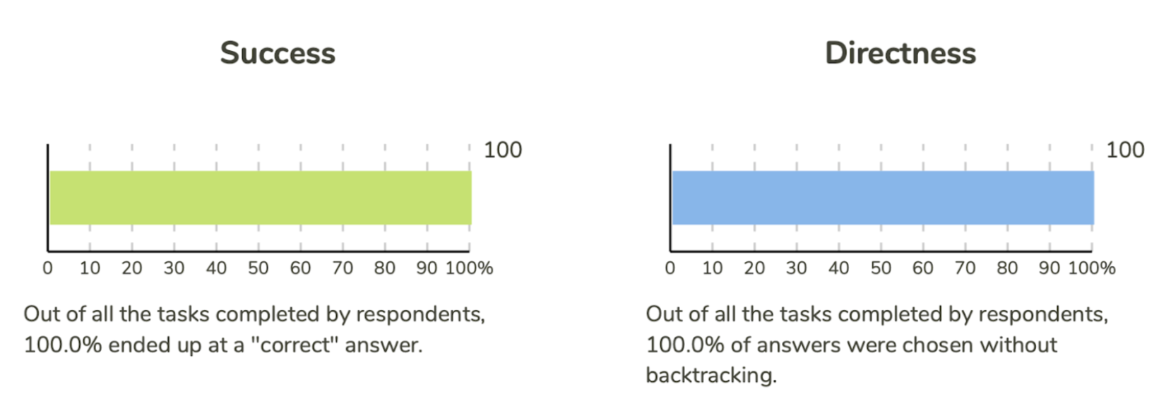
Respondents were able to easily find items in the menu and did not backtrack. There are few options allowing for a simple navigation.
Both respondents did comment the following
“Menu items are not located in the correct order and need to be in alphabetical or numerical order”
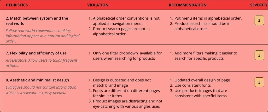
Analyzing Usability Issues
I conducted a heuristics analysis to measure the usability of the current apps user interface. I followed the 10 point checklist when evaluating the heuristics of Jules to locate potential flaws and areas the developers might have overlooked.
Task Analysis - TheRealReal
The Real Real is a popular e-commerce platform that specializes in pre-owned luxury products. I conducted a task analysis to purhcase “Mens Gucci shoes in size 9” on both platforms to evaluate navigation.
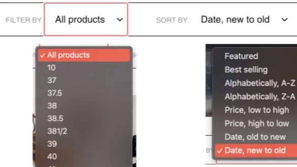
Jules: One filter dropdown with all options available

TheRealReal: Multiple filter options available
Results:
Three fewer steps needed to find specific items in product gallery.
Jules lacks an efficient filtering system to find products.
TheRealReal had a dedicated “Buy Now” button to enable for a quicker shopping experience.
Plus/Delta Analysis - Saks Fifth Ave
Saks Fifth Ave is a world-renowned luxury retailer that maintains a strong web presence and just like their products, their website also has a luxury feel to it. I conducted a plus/delta analysis between Saks and Jules to compare the shopping experiences.
Saks: Product recommendations provided on every page

Saks: Product gallery page with similar items aligned
Key Opportunities For Jules:
Product recommendations help users discover more products.
Product gallery displays similar products consistently making product comparisons easier.
Brand identity is consistent through out website with a simple and modern feel to the UI.
Synthesizing Our Data
Crafting a Persona

What Does Effective UX Look Like In E-Commerce?
Operational simplicity
Design that doesn’t overshadow brands or product but highlights them
Product promotion
“Buy Now” Button
Appropriate visual elements such as menus and catalogs
Hypothesis
Navigation menu that follows conventional design principles allows for intuitive navigation and operational simplicity
Adding usable product filters help users find specific products more efficiently
Product recommendations help users discover more products
“Buy Now” button provides an efficient way for users to purchase products
Minimalist design helps to highlight brands or products
Ideating Solutions
Paper Prototype
I began ideating by sketching out the home page, product gallery page, product detail page, and shopping cart. Next I turned it into a clickable prototype with Figma and tested it with users to ensure that I included every process in the user flow.

Grayscale Prototype
Using Figma I turned my sketches into a grayscale wireframe where I could outline the overall design and location of components. I assessed the usability of the prototype by having participants perform task such as purchasing an item and accessing certain pages. There was no need to make any major iterations from their feedback.

Prototyping
Building A High Fidelity Prototype
I then brought my designs to life by creating a high fidelity prototype. Once I felt confident that I had a prototype that was functional enough, I tested it with the same individuals that tested the original websites interface. I asked the participants to first visually examine each of the redesigned pages and communicate their initial thoughts. I then put the prototype through the same usability testing done with the original website. Participants noted some issues resulting in necessary iterations.
Prototype V1.0 Iterations
1) Hover Effects For Product Images
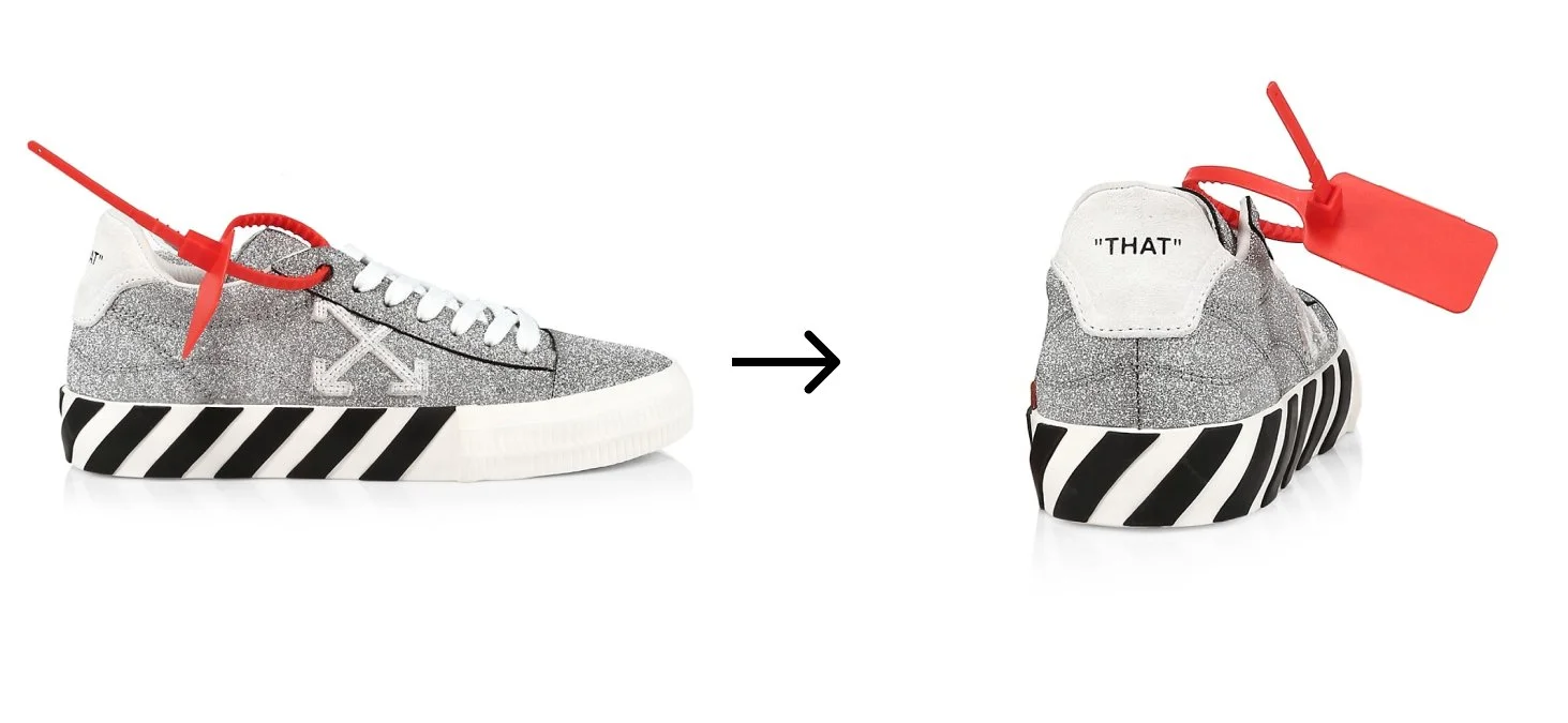
Users mentioned that they had trouble comparing products in the product gallery and wanted to see more angles of products without opening up the product detail page.
Added product preview images from another angle while users mouse is hovering over product. On the left is the product image displayed on gallery page while on the right is the image displayed if users hovers over the product.
2) Breadcrumb Navigation

While users were searching for products in the product gallery, users commented they would have liked to see a way to view what filters were selected and for a way to easily navigate back.
Breadcrumb navigation give users a better view of what filters were selected while searching for products. This is located near the top of the page to allow for easy viewing.
3) Disabling Billing Address Field

When completing a purchase users mentioned that they did not deem it necessary to fill out the shipping and billing address when both were the same.
Disabled billing address as a fillable filed if user selected the billing address was the same as shipping address.
Product Recap
Revamped Home Page
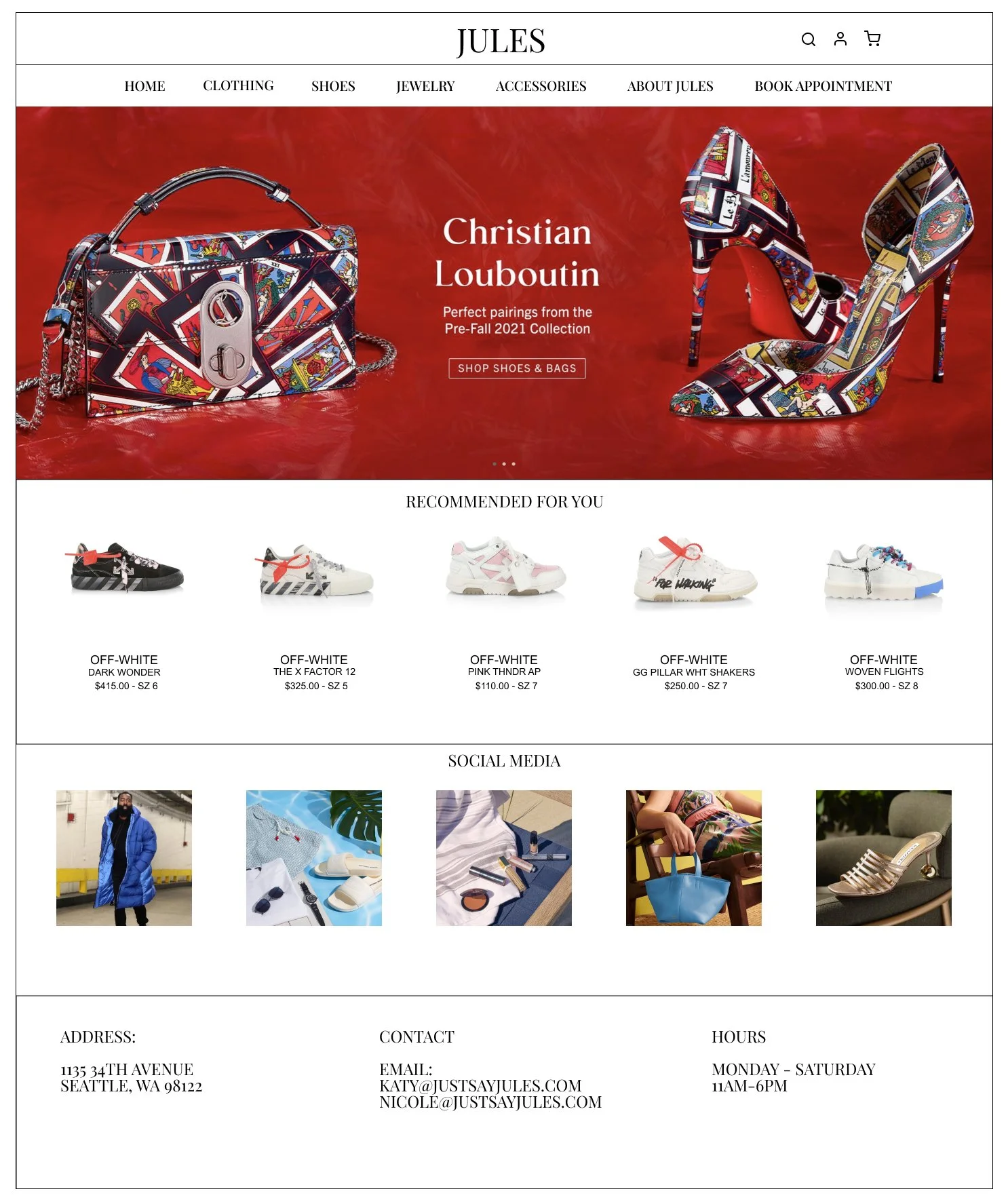
Highlighted products or brands are front page and brought to the users attention
Recommended products display items that are relevant to the users past search history or purchased items
Social media that link to shops IG page where items are further advertised to users
Updated Navigation Menu

Navigation dropdown menu items are organized in alphabetical order accessible to users when hovering over menu
Separate “Featured Designers” menu display designers that the shop can highlight and advertise to users
Certain product images can be displayed in the menu based of the item category allowing users to click on images taking them to product detail page
Functional Product Gallery

Multiple filters option are available for users allowing for quick and efficient search options
Products images are all very similar helping users compare product items side by side.
Navigation summary providing users with info on what is being displayed
Product Details

Multiple images of product available showcasing various angles
“Buy it now” button that provides users with a quick and easy method to purchase products
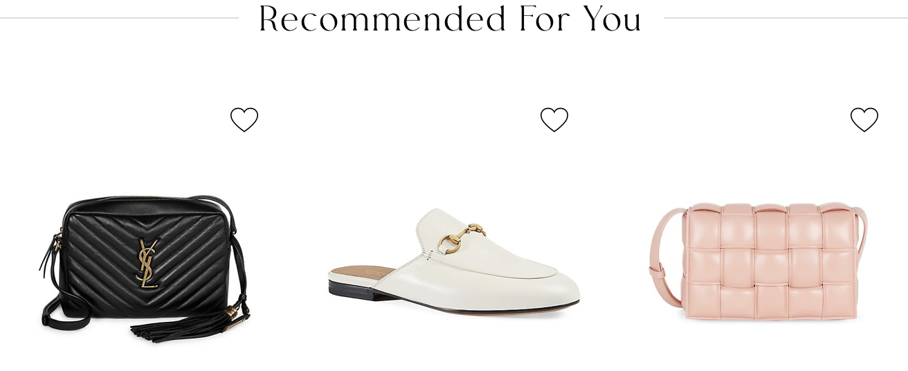
“Recommended for you” section guides users into viewing other products that are similar in nature that could entice users into other items.
Next Steps
Overall I felt this redesign was successful at achieving its goals of improving users shopping experience and also updating the website with a modern design. I would like to meet with engineers to implement this design and then focus on the analytics to further push traffic to Jules.
The client would also need to oblige to new responsibilities which includes product photos that are consistent with the type of item, and also to maintain product detail pages that provide relevant info to consumers. Jules is a small boutique store and it may be unfair to compare it to the likes of the larger luxury E-commerce platforms, however if the goal for Jules is to have the same luxurious feel online as their products than it must dream big.