IKEA
Increasing customer engagement through IKEA planners
3 Week Design Sprint / Mobile iOS App
Company Overview
IKEA is a multinational conglomerate that designs and sells; ready-to-assemble furniture, kitchen appliances, home accessories, and home services. They are not only known for their modernist designs and an eco-friendly simplicity, but also their massive warehouses, where consumers purchase most of IKEA’s products. For FY2019, online and mobile sales were only 9% of total sales with the remaining purchases being made at retail warehouses.
Project Brief
IKEA was not prepared for COVID-19 and their eCommerce completely fell apart. While working on the logistics part of the problem IKEA is seeking ways to better engage and support customers through a mobile application. We’ve been contracted by IKEA to establish user needs and create a mobile prototype that will allow users to discover, plan, and purchase items for their home with the opportunity to connect with a professional IKEA planner.
This project was conducted for educational purposes during our academic tenure with General Assembly. We are not affiliated with IKEA group.
My Role
I performed user research, competitor analyses, and also validated ideation with a participatory design activity. I facilitated the usability tests and also completed wireframes, prototypes, and revisions.
This project was done in collaboration with two designers during our academic tenure at General Assembly.
Problem Statement
The pandemic has negatively impacted IKEA’s E-commerce, resulting in an unsatisfactory user experience and low user engagement with the IKEA app. How might we increase user engagement and satisfaction of the IKEA app and help drive users to discover, plan, and purchase items.
The Current IKEA App
Our teams initial steps were to understand why some users are unsatisfied with the app and possible ways to improve upon those. We started by downloading the IKEA app and spending 30 minutes learning the ins and outs.
Initial Thoughts: Customers are able to purchase products but the app lacks the ability to reach out to IKEA planners and any support for design planning.
IKEA wants our team to design a way for users to reach out to planners but we need to ensure that this is something users want in the first place.

Discovery Phase
Survey & Interviews
We conducted a survey to learn about consumers overall furniture shopping experience and also their experiences with IKEA. Then we interviewed certain participants that had extensive experience shopping with IKEA and consolidated those responses into an affinity map.
WHAT USERS ARE SAYING
Product selection at IKEA is overwhelming
Frustrations with scheduling delivery times
Users enjoyed visiting IKEA to view products in person
Most were unaware IKEA had an AR feature on a separate IKEA app
Users were receptive to receiving interior design advice when selecting furniture
Understanding the Market
We completed a Plus/Delta analysis on IKEA’s direct & indirect competitors, which helped our team understand how furniture retailers and other e-commerce companies provided value to users.
Analysis Takeaways
Direct and indirect competitors utilize augmented reality (AR) allowing the user to digitally view an item within a room. This is feature is available to IKEA users but only if they download a separate app.
Modsy provides users with a quick design consultation/recommendations following a short quiz.
Competitor customers had no major issues with shipping by providing accurate delivery windows.

Define Phase
Crafting a Persona
We created a persona to document the mindset and patterns that we noticed from our research.
Hypotheses
We believe consultations with IKEA planners will help users with design decisions and increase engagement.
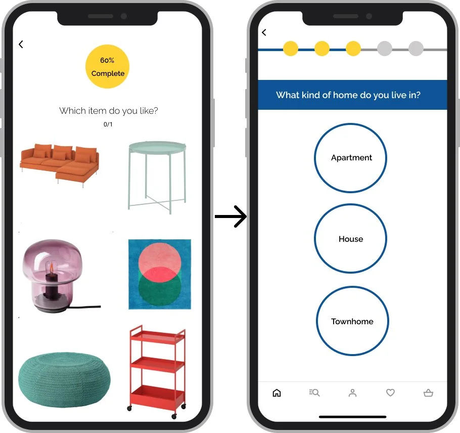
We believe a questionnaire & product recommendations help users discover products.
We believe AR is highly utilized by consumers and helps with product comparisons.
We believe providing accurate delivery schedules improves customer satisfaction.
Solution
Provide users with ability to consult with IKEAs planners using the app
Brief questionnaire to help users discover products and to assist IKEA planners with their design consultations
Provide users with a personalized floor plan and product recommendations that suit their needs
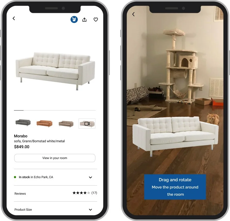
Integrated AR function to allow users to view products digitally within their home
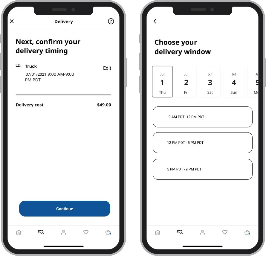
More accurate delivery windows to help users with their logistical planning
Goal
IKEA planners increase user engagement and provide unique value in the IKEA brand
AR is highly utilized by users and improves their shopping experience
Smaller delivery windows improve customer satisfaction with IKEA’s logistics

Ideation Phase
Design
Our team discussed ideas openly and sketched out various layouts of proposed designs. We then voted on a design we felt would best achieve IKEA’s goals and moved on to creating a low fidelity prototype.
Using Figma we built a lo-fi prototype and tested it with users to ensure the following
Home page directed user eyes to the design consultation
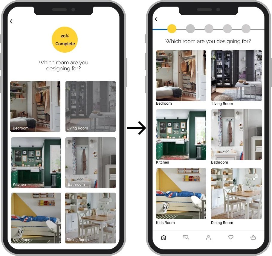
The questionnaire was simple and brief
The AR button was easy to access and distinguishable
High Fidelity Prototype V1.0
Usability Testing and Iterations
After building our high fidelity prototype in Figma, we put it through usability testing. Our testers had some usability issues and we deemed it necessary to make the following changes.
1) Consultation Banner
The design quiz button did not stand out and provided no context on value to the user.
Solution:
Integrated the button into the banner image
Provide more details on its purpose.
New banner image that further provides context
2) Questionnaire Layout UI
Issues:
Inefficient use of space
Progress bar was difficult comprehend
Solution:
New progress status bar that reduced white space.
Removed the user requirement to scroll with full page being displayed.
3) Questionnaire Content
Users felt questions were too specific and lacked a broader appeal.
Solutions:
Used broader questions and removed specific items all together to appeal to a wider audience.
4) Product Recommendations
Design of page and it’s components failed to comply to IKEA’s design style shown elsewhere
Solution:
Created new components and updated the design to match IKEA’s style

Final Product Recap
IKEA Planners
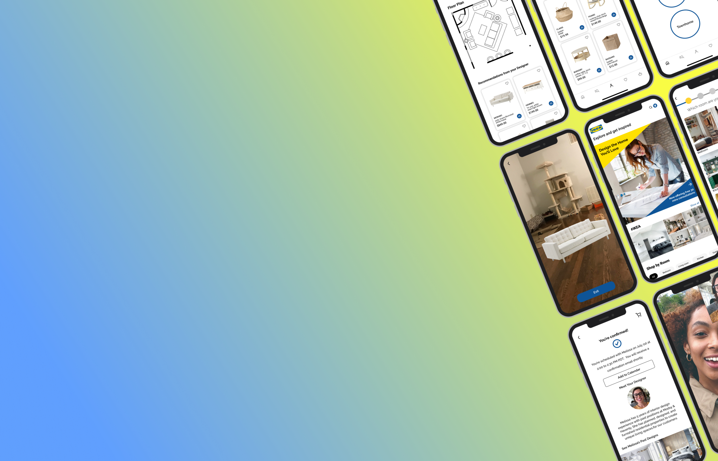
Users are able to schedule consultation with IKEA planners that can help users discover new products or plan a rooms layout. Users first complete a brief questionnaire about their needs and then have the option to schedule a consultation with the planner. The consultation provide planners with detailed information on user needs and constraints. The planner will then deliver a floor plan and personalized product recommendations for users to easily purchase.
Augmented Realty (AR)
AR will enable users to now view products digitally in their living space. This feature is easily accessed from a products detail page with a “View in your room” button.
Delivery Scheduling
Users can schedule deliveries in smaller delivery windows that reduces how long customers wait.
Lessons Learned
Will our team's re-design of Ikeas app slow down consumers' willingness to roam around Ikeas vast in-store maze? In the short term, probably not, but that’s speaking more about the pleasure that consumers get from visiting an Ikea - it’s a great experience that is unmatched anywhere else.
Our goal with the Ikea app was to build on the in store experience. I am confident we have accomplished that as users will now have a much more unique and engaging experience through the planner and AR features.


