PULSE
UI/UX overhaul for a relationship management tool
3 Week Design Sprint / Mobile iOS App
About Pulse
Pulse is mobile app that is a relationship management tool for users. The apps goal is to help with creating and sustaining productive relationships by improving how users network.
Pulse’s 3 functions:
Replacing business cards with users consolidating their social accounts into a Pulse profile that is shareable.
Networking reminders and follow-ups to help users with continued contact engagement and relationship growth.
Contact management utilizing tags and groups to easily categorize contacts.
The Challenge
We were tasked with redesigning the UI of the existing iOS app and assessing the user journey with current and potential users to enhance user satisfaction.
Stakeholder priorities? —> UI focused
“I’d love for the app to be redesigned with a more modern style. Users don’t love the current feel of the apps UI… This would include updating the home dashboard and contacts dashboard.”
My Role
I was responsible for design strategy, user research, heuristics analysis, user journey, ideation, interaction design, and prototyping.
This project was done in collaboration with two designers working in alignment with the Pulse lead designer.
Linear Design Process


Discovery Phase
Understanding Networking Behaviors
We conducted a survey with 50 participants to gain more insight on user behaviors while they network.

People relied heavily on native apps
Business cards are still highly utilized
Significant issues with following-up
Lack of awareness of Pulse or competitors.
What Are Pulse Users Saying?
We conducted user interviews with new, active, and previous users. This was the most vital element of our research because it enabled our team to gain insights on general and specific thoughts on Pulse. The priority here was to understand all the reasons why users were frustrated with the existing iOS app, whether it be a generalized issue or a specific one.
Analyzing Usability Issues
We conducted a heuristics analysis to evaluate the usability and followed the 10 point checklist locate potential flaws previous developers might have overlooked.

Serious Onboarding Issues
Users unable to skip unwanted state during onboarding
Users unable to go back during onboarding
Lack of help documentation leading to poor learnability
How Does Pulse Stack Up Against Competition?
We conducted a feature analysis to ensure that Pulse was able to provide a competitive experience relative to other popular relationship management tools.
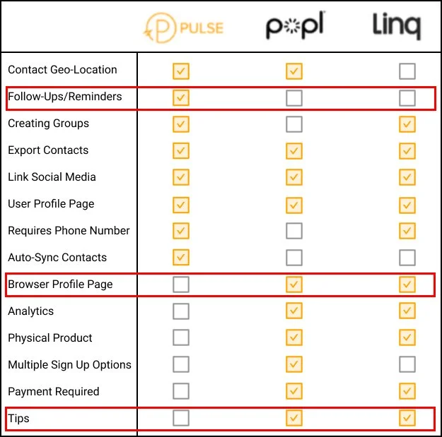
Takeaways:
Follow-Ups: This is a distinguishing feature for Pulse so it’s imperative to provide a memorable experience for users.
Browser Based Profile Page: Pulse did not provide users with a web-based profile which allowed people who did not have Pulse to view the users Pulse profile on a browser.
Tips: Competitors provided users with tips and tricks during onboarding to improve learnability for new users.
Define Phase
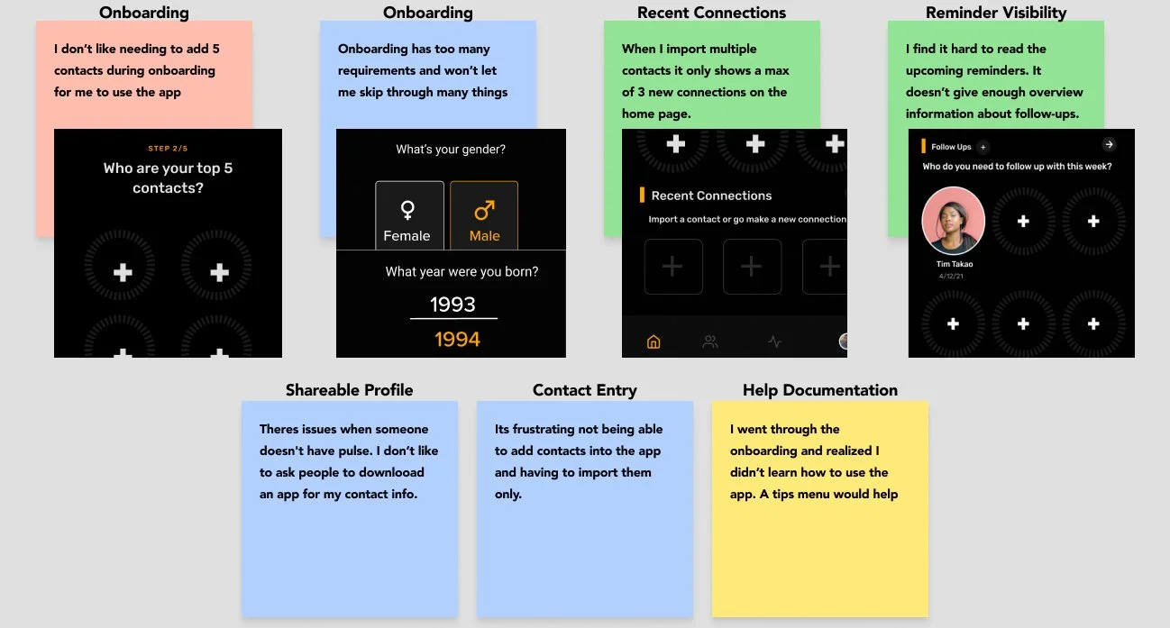
Organizing User Interview Responses
We took our user interview responses and created an affinity map to more accurately understand user thoughts into actionable items to resolve user frustrations.

A New Users Difficult Journey
We synthesized all of our findings by creating a customer journey to gain insight on how a new user interacts with Pulse and to highlight opportunities for improvment.
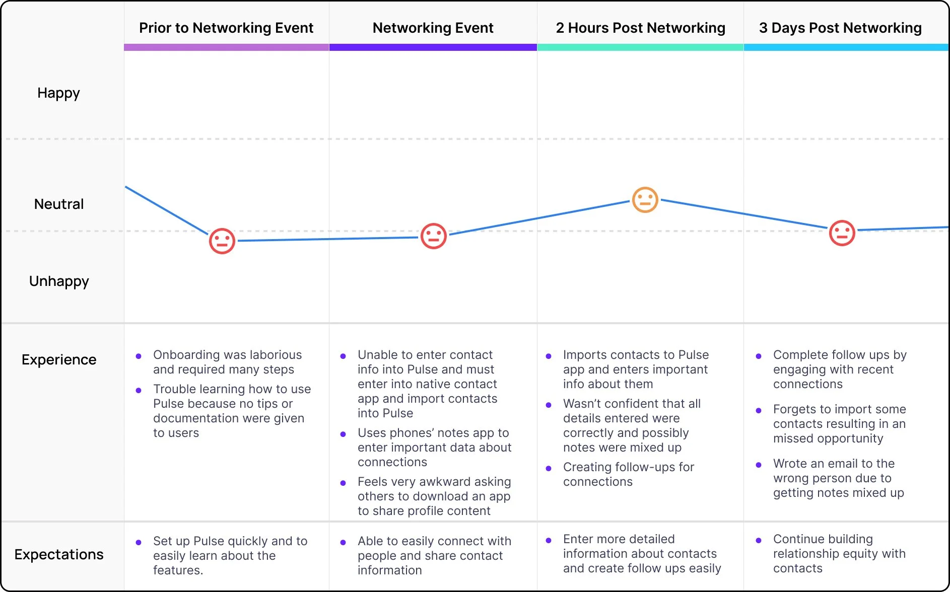
The user downloaded Pulse prior to a networking event and is expecting the app to enhance the networking process and to build on those connections afterwards.
Overall the user had a poor experience due to a tedious onboarding, inability to enter contacts directly into the app, and inability to share their profile with non-Pulse users.
Ideation Phase
Organizing Our Designs
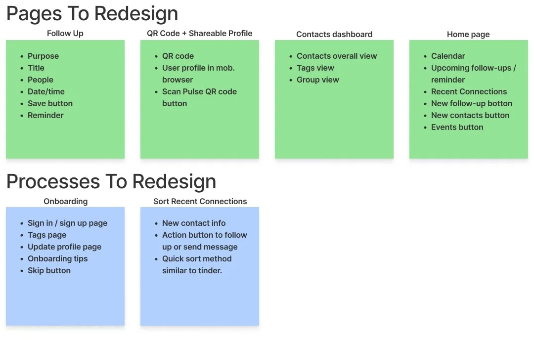
Before beginning to sketch we listed out UI elements and product specs for the entire project.
Sketches and Low-Fidelity Prototype
We conducted a design workshop to brainstorm and sketch initial ideas and collaboratively discussed interfaces and elements we liked or disliked. We then used Figma to build out a low-fidelity prototype based on our sketches.
We tested the low-fidelity prototype to ensure that the UI elements of the dashboards and overall redesign were intuitive, and app navigation was simple to follow. Our big takeaway was users felt the contacts dashboard was cluttered so we incorporated various component styles in the high-fidelity prototype to hopefully ease that feeling.


Prototyping Phase
Testing Sample UI Styles
We asked ourselves.. “How should our redesign make users feel?”. Our goal was to present a welcoming and friendly feel to users by incorporating gradients to invoke a bold yet relaxing feel to the app.
We created various UI samples and tested them with users to evaluate general feelings towards the styles.
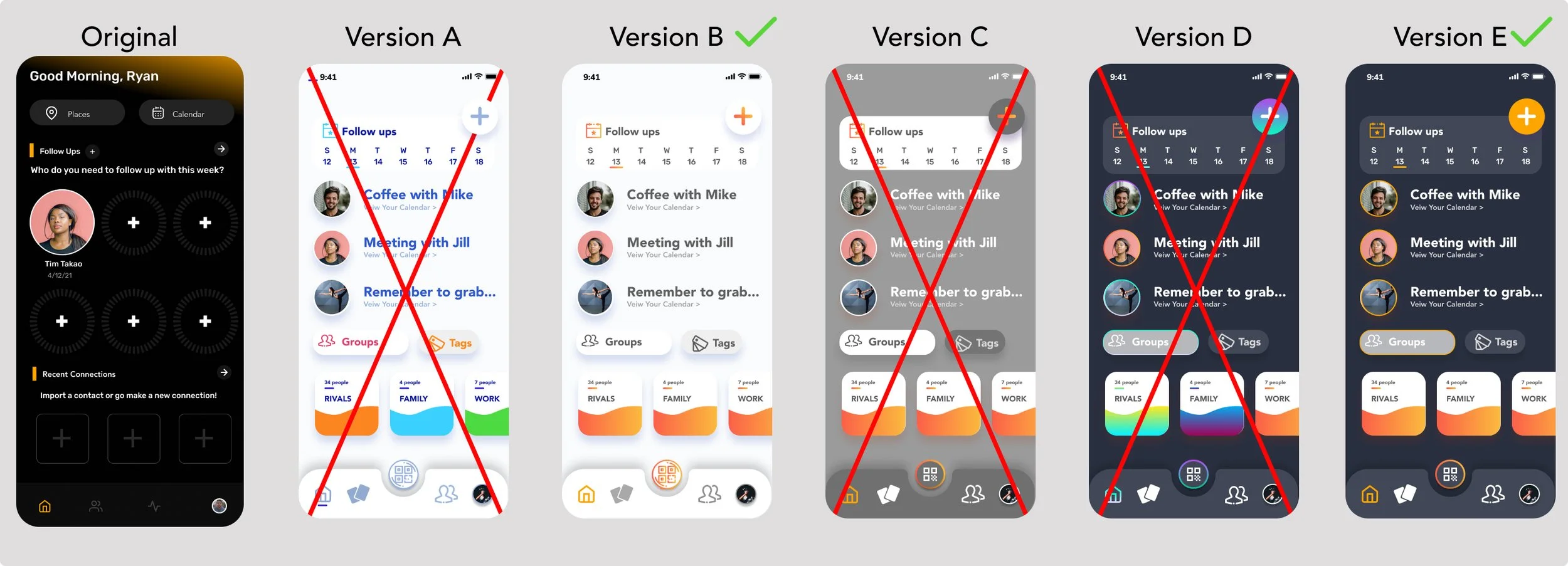
Version B & E were the most popular so we decided to move forward with those two light/dark designs to improve accessibility.
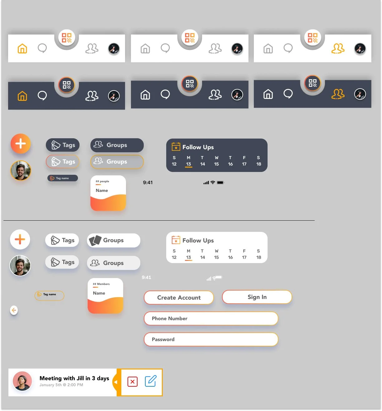
Design Style Guide
High Fidelity Prototype Version 1.0 Usability Testing and Iterations
After conducting usability testing on our version 1.0 high fidelity prototype, users identified some issues with our design and we made the following changes.
User Issues With Recent Connections UI
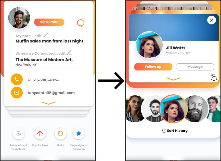
Issue:
Users commented that the recent connections sorting process was not intuitive with the buttons causing most of the confusion.
Solution:
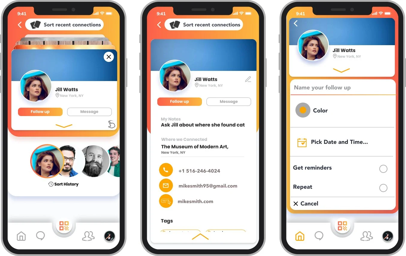
Removed the buttons and added a horizontal scroll carousel to quickly scroll between contacts. Users could previously edit information about new contacts on that screen but we felt that wasn’t an efficient use of space. Now users can tap on the contact to view or edit their details.
Final Product Recap
Streamlined Onboarding
Users now have more control over the onboarding process with skip options on most slide. Design elements and interactive components were added to further reduce onboarding length and to encourage users to fill out information.

Help Documentation Available
New users will quickly learn how to navigate through the application with tips displayed during onboarding. Once tips are dismissed users won’t need to address those again.

Reconfigured Home Page
New home dashboard provides users with their important information on one screen. Users can see their upcoming schedule, new connections, and access all features with one button.
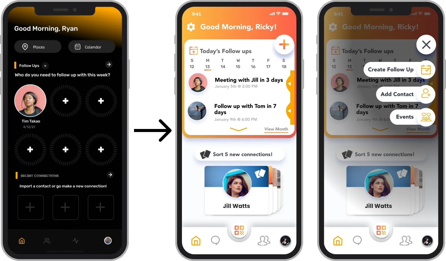
Improved Follow-Up Process
New follow-up process provides users with a modern design while also requiring fewer clicks than the old design to complete the same process.

New Process to Sort Recent Connections
Our new contacts sorting feature is an efficient method to manage new connections utilizing a card carousel at the top or the horizontal one below. With one click, users can schedule a follow up or send a message while also being able to view or edit details by tapping on the contact. We provided a sort history to ensure no contacts are lost.
Redesigned Contacts Dashboardds
The new contacts dashboard provides users with quick access to their contacts, groups, and contact tags. We improved user accessibility by lowering the search bar, adding a sort button and a swipe navigation between the sections.

Next Steps
Due to time constraints we had to condense the overall design process. We would have liked to test and iterate even further and explore some other features that we believe would have provided users with a unique experience.
Overall the stakeholder was very satisfied with our prototype as we successfully evaluated and redesigned all areas that were defined at the beginning of the project. Our team isn’t certain how much of our design would be implemented and that’d be decided only after working with Pulse’s engineers.
Next Steps:
Design messaging platform
Design web browser Pulse profile
Onboarding tips and animations still can be explored and tested more.
Current user reminders, notifications and engagement pop ups.
Possible other features to test, gamification, interactive calendar, chat, personality profile, and area adding.